
It is no secret that in the digital age, software design aesthetics are more important than ever. In fact, according to Adobe’s latest research, 66% of web users judge a website’s credibility based on its design rather than its content. The objective is to help software creators understand how to balance stunning visuals with user-friendly design. This challenge calls for an intricate understanding of design fundamentals, the target audience, and how users interact with various design elements.
A software’s visual appeal shouldn’t undermine its functionality. Balance is key. To achieve this, software creators need to consider the following:
- Consistency: Consistent design elements and themes maintain visual attractiveness and aid in navigation.
- Simplicity: Keeping the interface design as simple as possible makes it easier for users to understand and use.
- Accessibility: The software design should be accessible to users with varying abilities to maximize usability.
By designing with these factors in mind, software creators can indeed strike a balance between form and function, delivering not only visually pleasing but also user-friendly software. The aesthetics can draw users in, but it’s the usability that will keep them engaged and coming back for more.
1. Introduction: Balancing Aesthetics and Usability
When it comes to creating software, you know that it’s not just about coding. It’s also about creating an interface that’s visually appealing and easy to use. But striking that perfect balance? That’s where the true challenge lies. It’s like walking a tightrope. Lean too far towards aesthetics, and you risk creating a beautiful but confusing interface. Veer too much towards usability, and you may end up with a boring, uninspired design. It’s about finding that sweet spot where gorgeous visuals and user-friendliness meet.
It’s crucial, you know? Because the software is so much more than a tool. It’s an experience. And like any experience, it needs to be as pleasurable and effortless as possible. That’s why understanding the principles of aesthetics and usability is fundamental in software creation.
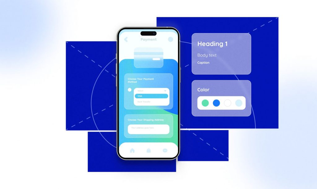
- Aesthetics: This involves the visual appeal of your software design. It’s what enchants the users first and draws them in. It’s color schemes, typography, images, and layout. But more than just making the software look beautiful, it’s also about creating a visual language that communicates and resonates with your users.
- Usability: This involves how easy it is for users to interact with your software. It’s about intuitive navigation, clear instructions, and a user-friendly interface. It caters to not just what your users want to do with your software, but also what they need to do.
Now that you understand what aesthetics and usability involve, the question is, how can you balance them in your software design? How can you make your software design both visually captivating and user-friendly? This article will guide you in finding that balance. Filled with practical tips, real-world examples, and expert advice, this guide is your compass in the exciting journey toward designing stunning yet user-friendly software.
2. Understanding Visual Design in Software

To begin, let’s get a clear picture of what visual design entails in the software realm. It’s not just about creating stylish and trendy interfaces. Instead, the core of visual design revolves around enhancing user experience by making the software more enjoyable, efficient, and easy to navigate. Appealing visuals can guide users seamless journey through your software, drawing attention to important features, easing the learning curve, and creating a memorable experience.
Visual design encompasses selecting and arranging visual elements, such as layout, colors, images, icons, fonts, and other graphic elements for maximum impact. Think of it as the “look and feel” of your software that users often relate to emotionally.
From the layout that divides the interface into different sections to the color scheme that conveys the mood, every aspect plays a role:
- Layout: Grids and templates create a structure, dividing the screen into zones. It helps in displaying information in an organized manner, aiding in usability.
- Colors: Color psychology plays a pivotal role in conveying mood and evoking emotions. It’s essential to choose the right colors that align with your brand and the purpose of the software design.
- Typography: Consistent use of fonts and sizes enhances readability and comprehension.
- Icons and Images: They not only add visual interest but also aid in swift navigation and understanding of functions.
With these elements, you weave a visual story that can captivate users and enhance their experience. Remember, the goal is not just an attractive interface but a thoughtful design that amplifies usability.
To sum it up, the fundamental theme of visual design is like a famous quote by Steve Jobs –
“Design is not just what it looks like and feels like. Design is how it works.”
Thus, creating a visually stunning, yet user-friendly software design is about striking the right balance.
3. The Importance of User-Friendly Design
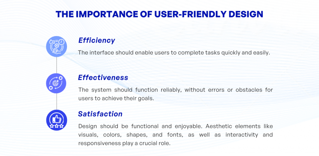
Let’s shed some light on the concept of user-friendly design. Simply put, user-friendly design means creating an interface that’s easy to use, understand, and navigate. But it goes beyond just simplicity.
User-friendly design is about ensuring that the software meets the needs of the user, and not the other way around. It involves accommodating various user experiences, expectations, and abilities. This means considering everything from readability to accessibility, from navigability to intuitiveness. When software is user-friendly, users can accomplish their tasks efficiently, effectively, and satisfactorily.
- Efficiency: The interface should be designed in such a way that users are able to perform their tasks quickly and without unnecessary steps or confusion.
- Effectiveness: The system should be reliable, performing its functions correctly and consistently. Users should achieve their goals without encountering errors or obstacles.
- Satisfaction: The design should not only meet the functional needs of the user but also provide an enjoyable experience. This often involves aesthetic elements like visuals, colors, shapes, and fonts, as well as interactivity and responsiveness.
Think about the simplest apps on your phone – aren’t they often the ones you use the most? This fact can’t be stressed enough: Complicated doesn’t mean powerful, and simple doesn’t mean basic. The power lies in striking the right balance between visual appeal and user-friendliness.
Good design is obvious. Great design is transparent.
Joe Sparano
In light of these considerations, the importance of user-friendly design becomes evident. It reduces user error, increases user satisfaction, and provides an intuitive and enjoyable user experience.
But, how can we balance this user-friendly design with stunning visuals? Keep reading to explore this interaction of aesthetics and usability further…
4. Harmonizing Visuals and Usability
When it comes to harmonizing visual designs and usability in software, it’s truly about walking a fine line. In essence, it’s like choreographing a dance where both the partners – the visuals and usability – move in flawless synchronicity. Yet, harmony is not about sameness. It is about complementing and supporting one another. So, how does one achieve this?
Firstly, understand your user demographic. Knowing your audience helps create an interface that appeals to them visually but also caters to their needs and habits. This information can guide software design decisions on elements like color, typography, and usability features.
Secondly, adopt the mantra “Form follows function”. In other words, aesthetics should serve the purpose of the application. This doesn’t require a sacrifice of beauty for efficiency but instead, a strategic blending of both.
Fundamentally, every design element should not only be visually pleasing but also serve a function that enhances user experience and interaction.
Incorporating consistency into the design also plays a part in harmonizing visuals and usability. Be consistent with visual elements like fonts, colors, and design styles and maintain uniformity in navigation, layout, and interactivity mechanisms. This fosters a sense of familiarity for the user and makes the software more intuitive and easy to use.
Using visual hierarchy assists in establishing order and guiding the user’s eye to key elements. Larger, bold elements draw attention, while smaller, subtle elements provide secondary information.
A consideration often overlooked is the contrast and legibility. Ensure sufficient contrast between the text and background. Too little contrast can cause eyestrain and hinder readability, whereas a clever use of contrast can guide the user’s attention to important parts of your software design.
| Steps to Harmonize | Actions |
| Understand your user demographic | Use this information to guide software design decisions |
| “Form follows function” | Blend aesthetics with purposeful application functionality |
| Consistency | Maintain uniformity in visual elements and interactions |
| Visual Hierarchy | Use design elements to guide user attention |
| Contrast and Legibility | Ensure easy readability by using contrast effectively |
The harmonization of stunning visuals and user-friendly design doesn’t occur overnight. It requires careful planning, strategic decisions, and iterative testing. Above all else, it requires an understanding of your users and a commitment to enhancing their overall experience with your software.
5. Real-World Examples of Successful Balance
Getting the perfect balance between visual aesthetics and user-friendly design can seem daunting at first. However, numerous software creators have triumphantly achieved this balance, providing us with executive examples to learn from. Let’s dive into a few of these examples:
- Adobe Creative Cloud: Adobe is well-known for its suite of software design and video software offerings, including Photoshop, Illustrator, Premiere Pro, and more. They have masterfully balanced functionality with stunning visuals. While the software is laden with robust features, the interface is kept clean and intuitive. Adobe uses consistent icons and color schemes across all its software to guide users effortlessly.
- Google’s Suite of Apps: Google’s applications, including Gmail, Google Drive, Google Docs, and Google Calendar, present a perfect example of unifying aesthetics and usability. Google’s Material Design concept adds a certain depth and tactility to the user interface, which enhances the overall user experience. Meanwhile, the straightforward software design and clear instructions support easy user navigation.
- Slack: Slack is another excellent example of software that seamlessly blends aesthetic elegance with user-friendly functionalities. Its multi-platform interface, attractive color schemes, and smart use of typography provide an enjoyable visual experience. However, what sets Slack apart is its focus on making the user experience as smooth as possible using easy-to-search features and intuitive navigation.
These instances manifest the successful amalgamation of design and function. By reviewing how these applications accomplish this balance, you can gain valuable insights to apply to your own software. Remember, the key to achieving this balance is to consider your users’ needs and preferences and to continually iterate on your software design based on their feedback.
6. Conclusion: The Art of Balance in Software Design
Striking that elusive balance between aesthetic appeal and user-friendly design in software is indeed an art. It’s firm footwork on a tightrope, requiring astute judgment and a deep understanding of your users. Not only should your software design have the ‘wow’ factor at every pixel, but at the same time, it must be intuitive and user-friendly. It’s all about creating a harmony that leaves an indelible impact on users and fosters a positive experience.
Three key points to remember:
- Visual aesthetics should not compromise the functionality of the software. Keep the navigation clear and maintain a consistent interface approach throughout.
- Usability must always be your highest priority. Think from your users’ perspective frequently, and conduct user testing as much as possible to gather actionable insights.
- The goal is not just about creating a beautiful interface. It’s also about designing an environment where users can accomplish their tasks effectively.
Pull into perspective the great masters of software design, who effortlessly unify beauty with utility. Akin to an artist deftly balancing light and dark, form and space, every software designer is striving to harmonize stunning visuals with an intuitive, user-friendly design.
Always remember, in the realm of software design, the sublime lies in the right balance, and balance is what we seek.
In conclusion, achieving ‘The Art of Balance’ in software design doesn’t just happen randomly. It’s a deliberate symbiosis of form and function, of beauty and utility. Stay curious, keep learning, and continue to enhance your design skills. Your journey toward mastering the art of balance in software design is full of exploration, and every step you take will bring you closer to creating software that is not only visually stunning but awe-inspiringly usable.
If you have any questions about software design, feel free to contact KVY TECH.