
Are you aware that as of 2021, 54.8% of worldwide internet traffic occurs on mobile devices? If you’re launching a startup, it’s absolutely crucial that your website is designed for this reality. When it comes to making your site mobile-friendly, you have two primary choices: responsive design or adaptive design. But what do these terms mean, and which one suits your startup best?
Statista
In 2021, 54.8 percent of all worldwide online traffic was generated through mobile phones, up from 50.3 percent in the previous year.
Responsive design and adaptive design are the solutions to the same problem, which is rendering web pages that look good and perform well on any device, any screen size, and any orientation. If you’re unsure about which approach to take, continue reading as we shed light on the pros and cons of each to help you make an informed decision.
1. Understanding Responsive Design
If you’ve dabbled in the world of web design, chances are you’ve come across the term ‘responsive design’. But do you really know what it entails? Let’s break it down.
Responsive design is a strategy in web design that aims to create websites that provide an optimal viewing experience across a wide range of devices. Why is that significant? Picture this – you’re on the go and you decide to pull out your smartphone to check a site. The site loads, but it’s clunky, the text is nearly impossible to read without zooming in, and you can’t seem to click the right links because they’re so squished together. This does not create a user-friendly experience, does it?
Now imagine if that same website automatically adjusted itself to it perfectly on your smartphone screen. No more pinching and zooming, the text is legible, and navigation is a breeze. That’s the magic of responsive design. The layout of the website guidly changes and responds according to different screen resolutions. Whether viewing on a large desktop monitor, a laptop, a tablet, or a small smartphone, a responsive design ensures the website will it the screen perfectly and deliver a seamless user experience.
It achieves this by using guid grids (where elements of a page are sized in relative units like percentages, rather than absolute units like pixels), flexible images, and CSS3 media queries. These media queries allow the page to use different CSS style rules based on the characteristics of the device on which the site is being displayed. Thus, it’s not just about shrinking or expanding a site, but about creating a complex and rich user experience, irrespective of the device being used.
Fundamentally, the goal of responsive design is to avoid the unnecessary resizing, scrolling, zooming, or panning that occurs with sites that haven’t been optimized for different devices. It’s about making the web accessible, regardless of where it’s being accessed from.
2. Pros and Cons of Responsive Design
2.1. The Advantages of Responsive Design
So, you’re within the realm of responsive design. Excellent! There are definitely plenty of benefits to this approach. Let’s delve into some of its significant advantages:
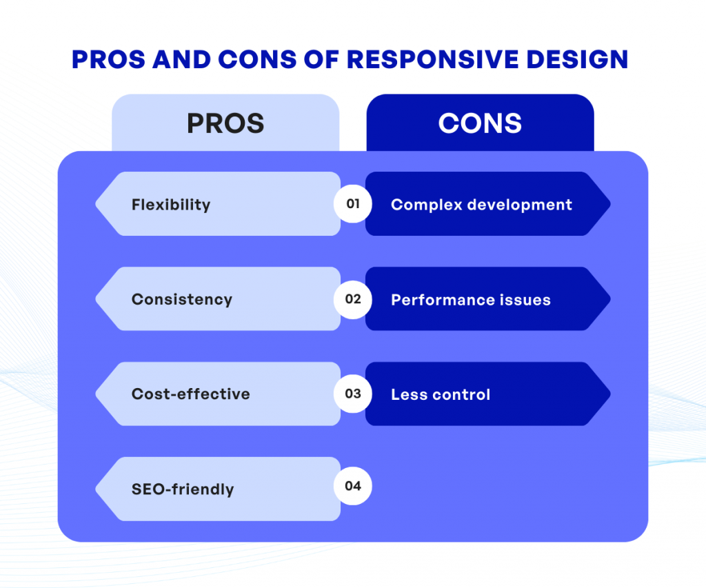
- Flexibility: The primary strength of responsive design is its flexibility. In an ever-changing digital landscape, you need a website that can adapt to any screen size, and that’s exactly what responsive design offers.
- Consistency: With a single layout that adapts to various screen sizes, your users enjoy a consistent experience, which in turn, helps build brand recognition.
- Cost-effective: Building one site that works everywhere makes things more efficient and cost-effective. You don’t have to spend time and money developing multiple versions of your site.
- SEO-friendly: Since a responsive design uses a single URL, it’s easier for search engines to crawl and index your website. This can help improve your search engine ranking.
2.2. The Drawbacks of Responsive Design
Yet, as practical as the responsive design might be, it isn’t without its shortcomings. Here are some of the challenges you could encounter:
- Complex development: Creating a responsive site requires a deep understanding of web design and development principles, which may necessitate a larger investment in professional design and development services.
- Performance issues: Sometimes, a responsive design can result in slower page load times, especially on mobile devices where all elements are downloaded, whether they’re displayed or not.
- Less control: The automatic resizing of elements can present some challenges, particularly when you want a specific layout for a certain screen size. In responsive design, you have limited control over how things are displayed.
In short, responsive web design can provide a flexible, consistent, and cost-effective solution for your website’s needs. However, it also requires a more complex development process and may pose performance issues. Asking yourself, “Would these pros outweigh the cons for my startup?” is an essential step in your decision-making process.
3. Understanding Adaptive Design
Now that we’ve delved comprehensively into the world of responsive design, it’s time to shift gears and step into the realm of adaptive design. Sounds interesting, you might say. But what does it actually entail?
Adaptive design, also known as progressive enhancement, involves creating different layouts for different screen sizes. The approach is somewhat akin to having multiple keys for different locks. When a user enters a website, the server detects the specific device’s attributes (like its screen size and resolution) and delivers a custom layout tailored to it. This means, that whether you’re browsing on a computer, tablet, or smartphone, you receive a website layout specifically designed for your device.
This style of web design owes its name to its primary characteristic: adaptivity. Understand it this way: an adaptive design does not respond to changes in browser size (like responsive design does). Instead, it adapts to it the predefined layouts for specific device types.
One particularly appealing aspect of adaptive design is the high degree of control it gives developers over the site’s design on different devices. For instance, if a feature doesn’t work well on mobile devices, the developers can disable it for the mobile layout without affecting its functioning on desktops.
So, is adaptive design the perfect solution to all website design needs? Well, not quite. As impressive as it might sound, every coin has two sides, and the pros come with their own set of cons. But we’ll get into those in the upcoming section. Are you ready to examine the pros and cons of adaptive design?
4. Pros and Cons of Adaptive Design
If you’re considering adopting an adaptive design method, it’s important to understand both the good and the not-so-good aspects of this approach. Let’s start by discussing the merits of this design strategy.
4.1. The Benefits of Adaptive Design
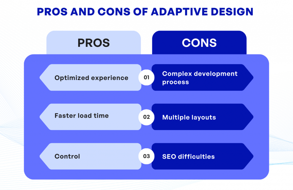
- Optimized experience: Because adaptive web design uses separate layouts for different devices, you can provide a truly tailored user experience on every platform.
- Faster load time: Specifically crafted for a particular device, pages using Adrian tend to load faster on that device, since they aren’t burdened by unnecessary code needed for other platforms.
- Control: The adaptive design approach allows for more control over your website’s aesthetics and functionality.
Despite these strengths, there are also negatives to be aware of when implementing an adaptive design.
4.2. The Drawbacks of Adaptive Design
- Complex development process: The creation of multiple layouts for different devices can be time-consuming and complicated. This complexity often results in a costlier and longer development process.
- Multiple layouts: Maintaining and updating separate layouts for each device becomes labor-intensive, especially if your site evolves over time or if new screen sizes become popular.
- SEO di?culties: Search engine optimization (SEO) can be trickier to get right with adaptive design than with responsive design, as search engines may recognize your multiple site versions as duplicate content.
Understanding these pros and cons will help you decide whether the benefits of adaptive design outweigh its potential drawbacks for your unique situation.
5. Responsive Design vs Adaptive Design: Which is better?
Now you’ve got a handle on what each approach offers and where they fall short, the next big question, naturally, is, “Which one should I choose for my startup?” The answer is not quite as clear-cut as you might hope, as it really boils down to what your specific needs and goals are.
Let’s walk through some key considerations. If you’re after a cost-effective, quicker solution that offers consistency across all devices, then responsive design might be your best bet. This is due to its one- size-its-all nature, emphasizing guid grids and flexibility. It’s especially well-suited to content-driven sites such as blogs and news platforms.
On the other hand, if your startup is more focused on delivering a superior user experience, particularly for mobile users, or you have the resources to fine-tune your site for different devices, then the adaptive design could be the way to go. It provides a more tailored user experience and can potentially lead to better engagement and conversion rates. E-commerce platforms, for example, often lean towards this methodology.
One key aspect to remember is that neither design is objectively ‘better’. It essentially boils down to a strategic decision based on your startup’s needs, resources, and long-term vision. Want to ensure that every visitor has a good experience? Responsive design is your answer. Desiring a polished, precise, and highly-tailored mobile experience? Look to adaptive design.
Lastly, don’t forget to keep user expectations and their evolving needs at the heart of your decision. After all, the aim of both responsive and adaptive design is to improve the user experience, no matter the device or browser they choose to use.
6. Final Thoughts
Choosing between responsive and adaptive design involves a careful analysis of your business needs, target audience, and technical capabilities. Each approach has its strengths and weaknesses, and the choice between the two often depends on your specific requirements and constraints.
For startups with limited resources, responsive design typically offers a more cost-effective and quicker solution. It’s highly flexible, ensuring your website performs well on a vast array of devices. However, keep in mind that responsive design gives you less control over your site’s appearance and functionality on each device.
On the other hand, adaptive design can provide an optimized user experience on different devices due to its device – specific layouts. But don’t forget, it requires more resources and time for implementation and maintenance. If you plan a robust mobile approach targeting specific devices and screen sizes, the adaptive design could be worth the investment.
No matter what approach you choose, always bear in mind the importance of user experience. An effective website design isn’t just about looking good – it needs to fulfill your users’ needs and expectations effectively and efficiently. You may want to ask fundamental questions like, “How does my target audience primarily access my website? What are their needs and expectations?” The answers will guide you in choosing between responsive and adaptive design.
At the end of the day, both responsive and adaptive designs are a means to an end – that end being delivering a smooth, satisfying user experience across multiple devices. Choose the option that will best help you achieve that goal, considering your budget, timeline, and the skills and capabilities you have at hand.
If you have any questions regarding responsive design vs adaptive design, feel free to contact KVY TECH.